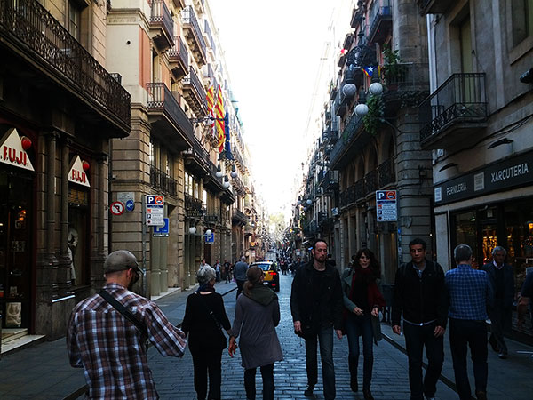
Basic Fluid Image
The simplest tactic for dealing with responsive images. The image is set to a maximum width of 100% of it's container and simply scales down as the screen size shrinks.
                        <style>
	/* Basic Fluid Image Pattern CSS */
    @media only screen and (max-width: 599px) {
        img.pattern {
            max-width: 100%;
            height: auto !important;
        }
    }
</style>

<img class="pattern" src="spain.jpg" alt="Spain" width="600" height="450" style="display: block; border: 0;" />